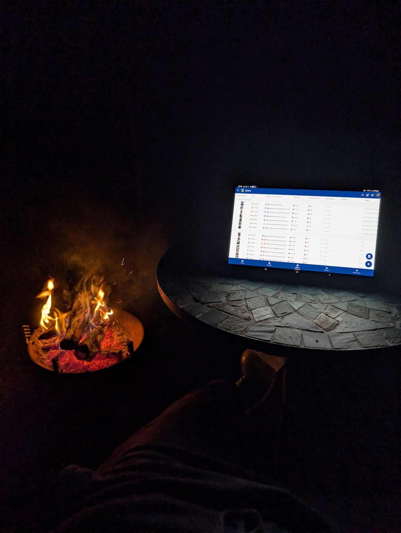

It is eleven at night, somebody is lying in bed with their phone in dark mode, and they open a link to your website. The screen fires a white sheet into their face. They close it before they finish the headline and they do not come back.
Now the other case, which gets discussed far less. A customer with astigmatism opens your site, which only does dark mode because that looked good in the design. White text on black starts to glow and blur for them. They read two paragraphs, give up and go elsewhere.
Neither of those two will write to tell you what happened. All that stays in your analytics is a short visit and an exit. Hence this article: light and dark mode is not a matter of taste or fashion, it is a function. Here is what the research says, how many people it affects, and what it means technically.
What the research says and what is a myth
Let me start with the least expected part, because without it the rest is just talk about impressions.
For people with normal or corrected vision, measurements favour light mode. A study published in the journal Ergonomics in 2013 compared dark text on a light background against the opposite, and light mode won across every task measured, in visual acuity as well as in proofreading, among younger and older participants alike.
The explanation is physiological and rather elegant: on a light background the pupil contracts. A smaller pupil means less influence from the eye's optical aberrations and a greater depth of field, so letters come into focus more easily.
More surprising still is a finding from 2017: dark mode did not do better at night either. In the dark, reading performance came out better with light mode, while during the day there was no significant difference between the two.
Which gives the first conclusion, and it runs against what most people believe: dark mode is not healthier and it does not cure tired eyes. Anybody claiming dark mode protects your sight is repeating an advertising line, not a measurement.
That is not the end of it, though, because reading performance is not the same as comfort, and it is certainly not the same as usability for people who do not see normally.
Dark mode is not healthier. It is necessary for some people and unusable for others. Which is why the feature is the choice, not the mode
Who dark mode genuinely helps and who it hurts
This is where a design debate turns into an accessibility question, and where it stops being about a minority.
Dark mode helps people with clouding of the lens and other conditions where light scatters inside the eye. In the research summarised by Nielsen Norman Group, participants with cloudy ocular media had better reading rates precisely in dark mode. It also helps people with photophobia, meaning painful sensitivity to light.
Dark mode gets in the way for people with astigmatism. White text on a black background blurs and glows for them, an effect called halation. And astigmatism is not a fringe condition.
How many adults have astigmatism
Composition in per cent
- Have astigmatism40.4%
- Do not59.6%
| Label | Value |
|---|---|
| Have astigmatism | 40.4% |
| Do not | 59.6% |
Two adults in five. That is not a group a website design can skip on the assumption that something else will work out.
On the other side stands photophobia. Migraine affects around 14 per cent of people and is the second most common neurological diagnosis in the world; of those with migraine, 80 to 90 per cent experience photophobia during an attack. For them a white sheet of screen in a dim room is physically unpleasant.
A site that only does light mode: in a dim room it glows like a torch. It puts off everybody whose phone is set to dark mode and hurts people with photophobia. Most evening mobile visits end with the tab being closed.
A site that only does dark mode: two adults in five with astigmatism read it worse, in bright sunlight it is unreadable altogether, and printed it looks like a fault. It looks good in the design and loses in the field.
Context decides, not taste
The key finding from the research is not which mode is better. It is that it depends on the situation the person is in, and that changes during a single day for the same person.
- Bed at eleven at night. The most common situation in which people read on a phone. A white sheet works as an alarm clock there.
- Outdoors in the sun. Exactly the opposite: dark mode reads worse on a screen in bright light, because effective contrast drops and reflections increase.
- Night shifts and control rooms. In a dim control room a light panel is glaring, and people dim it themselves even at the cost of legibility.
- A terminal on the shop floor or at reception. Nobody sets the lighting there to suit your website. The application has to work in both.
- An office facing south. The same person wants light mode in the morning and dark mode in the evening.
Which is exactly why the right answer is a choice rather than a decision made for the user. And because the user already made that choice in their system settings, a well built site asks there rather than in the footer.
Battery: the biggest myth and one interesting truth
That dark mode saves battery is the most common argument for it. Measurements from Purdue University on several phones with OLED screens revise it substantially.
How much screen power dark mode saves
Range in per cent
| Label | From | To |
|---|---|---|
| Brightness 30 to 50 per cent, where people usually keep a phone | 3% | 9% |
| Brightness 100 per cent | 39% | 47% |
At the brightness most people keep their phone at, dark mode saves single digit percentages. A noticeable saving only arrives at full brightness, which nobody keeps set permanently.
The side finding from the same measurement is more interesting: lowering brightness from one hundred per cent to fifty cuts display power roughly tenfold, whichever mode is on. Brightness decides far more about battery than the colour of the background.
The practical consequence for your site: feel free to drop battery as a reason for dark mode. The other reasons are better anyway.
What it means for a site to support dark mode
This is where a site that has dark mode parts company with a site that has a dark background colour. There are eleven items, and most of them are invisible until they are missing.
| What has to be done | When it is missing |
|---|---|
| Read the system preference via prefers-color-scheme | The site ignores a setting the person made once for every application |
| Remember the visitor's own choice | The switch lasts until the next page and is then forgotten |
| Set the theme before the page renders | A white flash on every load, exactly what drives people away |
| Declare the theme to the browser via color-scheme | Form fields, scrollbars and date pickers stay light inside a dark site |
| Colours only through tokens, never hardcoded | One component stays white and breaks the whole page |
| Logos and images with transparent backgrounds | A black logo on a black background, a white rectangle in the middle of a dark page |
| Dim or blend screenshots and photos | A photo glares like a floodlight and overpowers the text |
| Charts and icons from tokens, not fixed colours | The chart disappears in dark mode because it was drawn for white |
| Check contrast in both themes | Dark mode looks elegant and fails accessibility |
| Keep print and PDF light | The visitor prints a black page and burns through toner |
| Think about the emails the site sends | The mail client inverts the colours itself and the template falls apart |
That last row is not marginal. According to Litmus measurements, an average of 35 per cent of email opens in 2022 happened in dark mode, because mail clients invert colours themselves and often badly. An order confirmation arriving as black text on a black background is the same loss as a broken website.
The good news is that technically none of this is exotic. The prefers-color-scheme query, which reads the system preference, has been widely available since January 2020. It is not new and not experimental, it is a six year old standard.
Where it usually breaks
These are not theoretical faults. This is what I actually see in dark modes, and some of it I have been through myself.
- A light flash on load. The theme gets set only after JavaScript runs, so white shows for a moment. A small script that runs before the page renders fixes it.
- The theme is lost when moving to another page. I had this one on this very site and it cost me half a day: the theme is written to the html element by a script outside React, and as soon as React changes anything else on that same element, the language for instance, the write disappears and the site falls back to light.
- Pure black and pure white. Maximum contrast is exactly what causes halation with astigmatism. Dark mode should be a very dark colour and very light text, not the extremes.
- One component with a hardcoded colour. It shows up a month later, usually in the cart or in a form, which is where it hurts most.
- Images with white backgrounds. Most often partner logos and screenshots.
- Contrast sacrificed for looks. Grey text on dark grey looks calm in the design and is unreadable in use.
Contrast is calculated, not guessed
No standard demands dark mode from you. What it does demand is contrast between text and background, and that applies to every mode you ship. WCAG accessibility requires a ratio of at least 4.5 to 1 for normal text.
Here are the measured values for this site's dark mode. They are not estimates, they are calculated from the colours the site actually uses.
Contrast in this site's dark mode
| Label | Value |
|---|---|
| Body text on background | 16.8 |
| Brand colour on background | 8.7 |
| Text on a button | 8.5 |
| Muted text on background | 8.3 |
| Faintest text on background | 5.8 |
| WCAG AA requirement for normal text | 4.5 |
The point of that chart is not to boast. It is that anybody can calculate this number, for any website, so it cannot be talked around. When somebody claims their dark mode is accessible, it takes two minutes to check.
Photos and graphics: where a layperson spots a bad dark mode
Text colours get discussed constantly, images almost never. And images are where dark mode most often looks unfinished.
A photo shot in a studio on a white background glares in the middle of a dark page. A partner logo in its black version disappears. A screenshot of a light application overpowers everything around it. And a chart drawn in fixed colours vanishes, because it was designed for white.
The answer is not to swap the photos for darker ones. The answer is to treat them as part of the theme:
- Blend them with the background. On this site photos blend by multiplying in light mode and by screening in dark mode, with their saturation and opacity changing as well. One photo then fits both themes and never glares.
- Logos in a transparent format and in two variants wherever one will not do.
- Dim the screenshots or give them a frame in dark mode so they do not read as a hole in the page.
- Draw charts from tokens. The charts in articles on this site contain not a single fixed colour, so they redraw themselves in both themes. You can verify that by switching the theme on the charts above.
What to demand from a supplier when you order a website
You do not need to know CSS to keep this part in check. Six sentences in the brief and a check after delivery are enough.
| What to require in the brief | How to verify it |
|---|---|
| The site respects the system theme setting | Switch the mode on your phone and open the site |
| A theme switch on the site and the choice remembered | Switch, go to another page and come back |
| No flash on load | Reload the page and watch the first moment |
| Contrast above 4.5 in both themes, documented by calculation | Ask for the table of values, not a verbal assurance |
| Images, logos, charts and forms handled in both themes | Go through a form and a page of logos in dark mode |
| Print and emails stay readable | Print the page to PDF and open a confirmation email in a dark client |
Anyone who refuses these points in a quote, or marks them as an extra, is telling you the site is not built on tokens. That is information about everything else you will deal with together, too.
How I handle it
So that this is not purely theoretical, here is the actual approach I use, including two things I learned the hard way.
- Colours only as tokens. Every colour is named in one place and exists in both themes. A component never knows a specific colour, only its name. The second theme is then a second set of values, not a second set of files.
- The theme is set before rendering. A short script in the head reads the stored choice, or the system setting, and writes the theme before the page renders. Without it, white flashes.
- The choice survives navigation. This is the mistake I made myself: the theme is written to the html element by a script outside React, and when the language changed, React overwrote it. Restoring the choice on every route change fixes it.
- Contrast is calculated, not guessed. A new colour has to clear the ratio against the background in both themes or it does not get used. The numbers from that calculation are in the chart above.
- Photos, charts and form controls get handled separately, because that is where dark mode falls apart most often.
How to check your own site in five minutes
You need no developer and no tools. A phone and a quiet moment will do.
- 1Turn on dark mode on your phone and open your site. If it stays white, the site does not read the system preference at all.
- 2Reload the page and watch the first moment. If white flashes and then goes dark, the theme is being set too late.
- 3Go to another page and back, and switch language if you have one. The theme has to survive.
- 4Go through a form: fields, date picker, scrollbar. Light controls inside a dark page give away a missing color-scheme.
- 5Find a partner logo, a screenshot and a chart on the site. These are the three places dark mode fails most often.
- 6Print the page to PDF. It should come out light, not black.
If the outcome is that the site has no dark mode at all, that is not a disaster. It is a decision that can be made deliberately. The disaster is a half finished dark mode, because that puts off even the people who would have been fine with the light version.
What it costs
The answer splits awkwardly in two, and it depends purely on how the site is built inside.
When a site is built on colour tokens, meaning every colour is named in one place and components merely use it, a second theme is a matter of hours. You add a second set of values and check the contrast.
When a site has colours hardcoded in individual components, which is how most template sites look, it is a rewrite of the whole stylesheet and a hunt through dozens of files. That is why dark mode so often never gets finished on an existing site: it was not started there.
On the sites I build it is part of the design from the beginning. Not as a premium service, but because the tokens get built anyway and the second theme is then just a second set of numbers. You can verify it right now: the switch is in the header of this page, and the theme survives moving to another page and switching language.
Frequently asked questions
Does a website have to have dark mode?
No regulation requires it. The practical reason is different: a large share of people have dark mode enabled in their system and a light site glares at them in a dim room. The opposite holds too, because two adults in five with astigmatism read white text on black worse. So the right answer is not one mode but a choice, and respecting the system setting.
Is dark mode healthier for your eyes?
It is not, and that is the most widespread myth on the subject. In measurements, people with normal vision do better in light mode, including at night. Dark mode helps people with a clouded lens and with photophobia and reduces glare in dim rooms; those are good reasons, but they are not health reasons for everybody.
Does dark mode save battery?
On an OLED screen yes, but at the brightness people normally keep a phone at it is 3 to 9 per cent of display power. The noticeable 39 to 47 per cent only comes at full brightness. Halving the brightness cuts display power roughly tenfold regardless of the mode.
What is prefers-color-scheme?
A CSS query through which a site reads whether a person has light or dark mode set in their system. It has been widely available since January 2020 and it is the standard way for a site to ask about a choice the user has already made.
Why does my site flash white on load?
Because the theme is set only after JavaScript runs. A short script that runs before rendering and sets the theme from the stored choice or the system fixes it. Without that, every visitor in dark mode sees a flash of light on every load.
Should dark mode be black?
It should not be pure black with pure white text. Maximum contrast is what causes halation with astigmatism, meaning glowing and blurred letters. Use a very dark background and light but not white text, and check the contrast by calculation.
How do I know a dark mode is done properly?
Six tests: it does not wait for JavaScript and does not flash, it survives moving between pages and switching language, form controls are dark too, logos and screenshots have no white background, charts remain visible, and print comes out light. And the text contrast is above 4.5 to 1, which can be calculated.
How much does adding dark mode to an existing site cost?
When the site is built on colour tokens, hours of work. When colours are hardcoded in individual components, it is a rewrite of the whole stylesheet and it tends to cost more than changes that look far more complicated. On the sites I build the second theme is part of the design from the start.
Summary
- Neither light nor dark mode wins. The choice wins, because each of them is unusable for some people.
- For normal vision, measurements favour light mode, including at night. The claim that dark mode is healthier is not supported by measurement.
- Dark mode helps people with a clouded lens and with photophobia, and hurts people with astigmatism, who make up 40 per cent of adults.
- Dark mode saves little battery unless your screen sits at full brightness. Brightness matters far more.
- Supporting dark mode means eleven things, not one background colour. What is missing most often is setting the theme before rendering, dark form controls and a contrast check.
- Contrast in both themes is calculated, not guessed. On this site the lowest value is 5.8 in dark and 5.6 in light, both above the 4.5 requirement.
Want a site that does both properly
The switch in the header of this page works, the theme survives moving to another page and switching language, and the contrast in both themes is calculated rather than estimated. That is exactly how I build sites for clients.
Write to me about what you are dealing with and we will go through it. If the conclusion is that dark mode will do nothing for you and other things matter more, I will say so.
Send an enquiry, see what the work includes or the price list.
Sources
- Nielsen Norman Group: Dark Mode vs. Light Mode, Which Is Better?
- Hashemi et al.: Global and regional estimates of prevalence of refractive errors
- American Migraine Foundation: Photophobia and Migraine
- Purdue University: dark mode battery measurements on OLED displays
- Litmus: share of email opens in dark mode
- MDN: prefers-color-scheme